Have you ever found yourself drowning in a sea of numbers, tables, and spreadsheets? 
If so, you’re not alone! Data can be overwhelming, but there’s a secret weapon that can help make sense of it all—
Data Visualization! 
Did you know that our brains process visual information 60,000 times faster than text? 
No wonder Data Visualization has become such a hot topic!  In fact, researchers have found that using visual aids can improve learning by up to 400%
  . And who doesn’t love a good infographic or chart that brings data to life, right?
Now, you might be wondering, “What exactly is Data Visualization?” 
Well, it’s the art and science of presenting data in a graphical, visual, or pictorial format to help people understand complex information more easily. 
And the best part?
It’s not just about making data look pretty—it’s about uncovering insights, spotting patterns, and making better decisions. 
For instance, have you ever tracked your fitness goals using a colorful progress chart?  Or perhaps you’ve seen a captivating map of global temperature changes over the years?
These are just a few examples of how Data Visualization can turn numbers into meaningful stories. 
So, are you ready to dive deeper into the world of Data Visualization and discover its importance and applications?  If your answer is a resounding
“Yes!”, then buckle up, because we’re about to embark on an exciting journey! 
Let’s get started! 
Table of Contents
- What is Data Visualization?
- Brief history of Data Visualization

- The role of Data Visualization in the modern world
- Importance of Data Visualization
- Types of Data Visualizations

- Applications of Data Visualization

- Challenges and Considerations in Data Visualization
- Summary
What is Data Visualization?
You know how we sometimes use emojis and GIFs to make our texts more fun and easier to understand?  Well, Data Visualization is kind of like that, but for numbers!
It’s all about taking loads of data and turning it into visuals like charts, graphs, and maps to help us see and understand information more quickly and easily. 
Brief history of Data Visualization
Now, you might think Data Visualization is a new thing, but it’s been around for quite some time!  In fact, one of the earliest examples dates back to the year 1786 when William Playfair, a Scottish engineer, and political economist, created the first bar chart to show the import and export data of Scotland.
Talk about a visionary, right?  Since then, we’ve come a long way, with all sorts of advanced tools and techniques that help us make sense of the data-driven world we live in today.
The role of Data Visualization in the modern world
Data Visualization has become super important in our digital age because we’re dealing with an insane amount of data every day!  In fact, it’s estimated that by 2025, the world will create 463 exabytes of data daily—that’s equivalent to 212,765,957 DVDs per day!
So, we need a way to make this information more digestible and actionable, and that’s where Data Visualization comes in! 
Whether it’s keeping track of your followers on Instagram  , understanding trends in the job market , or even making sense of climate change data
  , Data Visualization helps us make better decisions and communicate our ideas more effectively.
Importance of Data Visualization
Alright, let’s talk about why Data Visualization is so important, especially for us young folks in this fast-paced, data-driven world!
Facilitating better understanding of complex data
Ever felt overwhelmed by a giant spreadsheet full of numbers? Data Visualization is like a life-raft that helps us make sense of all that information!  By turning data into visuals, we can better understand what’s going on and find insights that might’ve been hidden in plain text.
For example, imagine comparing the popularity of different music genres in a table versus a colorful pie chart—it’s way easier to see which genre is the most popular at a glance, right? 
Enhancing decision-making processes 
Data Visualization is a game-changer when it comes to making decisions. Imagine you’re trying to choose the best city to move to for a job.  By looking at a visual representation of salary, cost of living, and job opportunities in each city, you can make a more informed choice!
In fact, 74% of organizations say that Data Visualization has a significant impact on their decision-making processes. 
Enabling effective communication of information 
Have you ever tried to explain a complex concept to a friend, only to have their eyes glaze over?  Data Visualization can help! By turning numbers into visuals, you can communicate your ideas more effectively and keep your audience engaged.
For example, a well-designed infographic about climate change can convey crucial information in a way that’s easy to understand and share on social media. 

Identifying patterns, trends, and correlations in data 
Data Visualization helps us spot patterns and trends that might be tough to see in raw data. For example, imagine tracking your daily steps on your phone.  A line chart can show you how your activity level changes over time, making it easier to spot days when you were super active or maybe not so much.
Plus, you can identify correlations, like if you tend to walk more on sunny days! 
Stimulating creative problem-solving and innovation
Data Visualization can spark our creativity by helping us see things from new angles!  By visualizing data in different ways, we can uncover hidden insights and come up with innovative solutions to problems.
For instance, visualizing traffic patterns in a city can help urban planners design more efficient public transportation systems, reducing congestion and improving quality of life. 
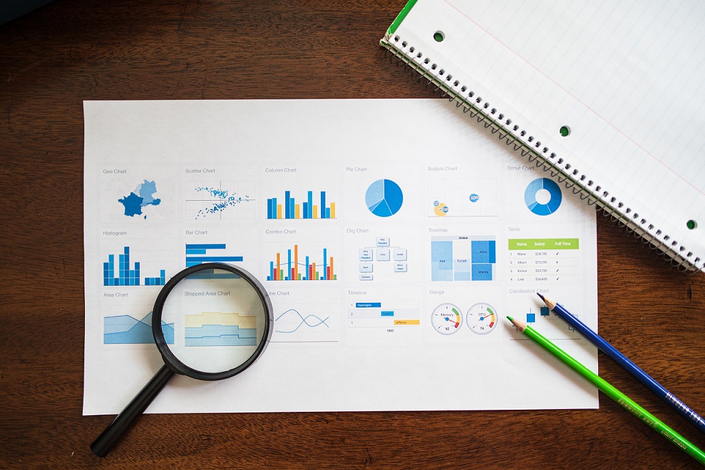
Types of Data Visualizations
Ready to explore the amazing world of Data Visualization? 
There are so many ways to turn numbers into visuals, and each type has its own unique strengths!  Let’s take a look at some popular types of visualizations:
Charts and Graphs
- Bar charts: These are perfect for comparing different categories, like showing the number of followers for your favorite celebrities on Instagram. Kim Kardashian has 250 million followers, while Dwayne “The Rock” Johnson has 320 million. Who’s more popular? A bar chart can show you at a glance!

- Line charts: Want to see how something changes over time? Line charts are your best friend! For example, they can help you visualize the ups and downs of your favorite cryptocurrency like Bitcoin.

- Pie charts: Mmm, pie!
 But seriously, pie charts are great for showing proportions, like the percentage of people who prefer dogs
  , cats
  , or other pets.
- Scatterplots: These are awesome for finding relationships between two variables. For example, you could use a scatterplot to see if people who spend more time on social media tend to have higher or lower grades.


- Area charts: Similar to line charts but with a twist—area charts fill in the space below the line to emphasize the magnitude of changes over time. Great for visualizing things like website traffic or sales data.
Maps and Geographic Visualizations 
These help us understand data related to locations, like showing the most popular travel destinations or visualizing the spread of a viral outbreak. 

Infographics 
Infographics combine visuals with text to tell a story, like an eye-catching graphic that explains the environmental impact of plastic pollution. 

Network Visualizations
These are super useful for showing relationships between different things, like a map of your Facebook friends or a visualization of how different movies are connected through shared actors. 
Hierarchical Visualizations (e.g., treemaps) 
Ever felt lost in a forest of data?  Hierarchical visualizations, like treemaps, help you see the structure of data by organizing it into nested rectangles, making it easy to understand complex hierarchies like the breakdown of your spending habits.
Time Series Visualizations 
Time flies when you’re having fun, but time series visualizations help you keep track of it! These are perfect for showing how data changes over time, like visualizing the rise and fall of your favorite music artists on the charts. 
So there you have it—a quick tour of the wonderful world of Data Visualization! Now that you’re familiar with these types, you’re all set to explore data in new and exciting ways!  Keep experimenting, and you might just find the perfect visualization to tell your next data-driven story!
Applications of Data Visualization
Data Visualization is like a Swiss Army knife—it has so many practical uses in different fields!  Let’s check out some real-life examples of how Data Visualization is making an impact across various industries.
Business Intelligence 
- Sales and marketing analysis: Companies use Data Visualization to understand customer behavior, like creating heatmaps to see which products are most popular on an online store.

- Financial performance tracking: Businesses can visualize their revenue, expenses, and profits over time to identify trends and make better financial decisions.
- Supply chain optimization: By visualizing the entire supply chain, companies can spot bottlenecks and improve efficiency.

Healthcare and Medical Research 
- Visualizing health trends and patterns: Data Visualization helps us see patterns in disease outbreaks, like tracking COVID-19 cases across the world.
- Clinical trial analysis: Researchers can visualize the effectiveness of new treatments by comparing the results of clinical trials.

- Genomic data visualization: Scientists use Data Visualization to explore the complex world of genes and DNA, leading to groundbreaking discoveries.

Environmental and Climate Sciences
- Climate change modeling: Visualizations can help us understand the effects of climate change, like melting ice caps and rising sea levels.
- Biodiversity tracking: Data Visualization can show the distribution of different species and how they’re affected by factors like habitat loss.

- Disaster monitoring and management: Visualizations can help us prepare for and respond to natural disasters like hurricanes, earthquakes, and wildfires.


Social Sciences and Public Policy
- Census data analysis: Visualizing census data helps us understand population trends and inform public policy decisions.

- Economic indicators tracking: Data Visualization helps track economic indicators like unemployment rates, GDP growth, and inflation.

- Visualizing social inequality: By visualizing data on income, education, and healthcare access, we can better understand and address social inequality.

Sports and Entertainment
- Performance analysis and optimization: Athletes and coaches use Data Visualization to analyze performance and develop winning strategies.
- Fan engagement and content creation: Interactive visualizations and data-driven content can keep fans engaged and entertained, like visualizing the stats of your favorite soccer players.

- Gamification of data visualization: Turning data into games and interactive experiences can make learning and exploration more fun and engaging!

Challenges and Considerations in Data Visualization
Creating amazing Data Visualizations can be a bit tricky sometimes!  There are several challenges and considerations to keep in mind when working with data. Let’s take a look at some of the most important ones:
Ensuring data accuracy and quality
Garbage in, garbage out, right? 
To create meaningful visualizations, it’s crucial to use accurate and high-quality data. This means double-checking your sources, cleaning up any inconsistencies, and dealing with missing or incomplete data. Remember, even the most beautiful visualization can be misleading if the underlying data is flawed! 
Balancing aesthetics with functionality
Designing a visually appealing Data Visualization is important, but it’s also essential to make sure it’s easy to understand and use.  Think of it like choosing a smartphone—you want it to look good, but it also needs to work well!
So, be mindful of choosing the right colors, fonts, and layouts to create visualizations that are both pretty and practical. 
Addressing ethical concerns and privacy issues 
In our data-driven world, privacy and ethics are more important than ever!  When creating visualizations, be sure to protect sensitive information and avoid revealing personal details that could put people at risk.
Also, consider the potential consequences of your visualizations and how they might influence people’s opinions or actions.
Catering to diverse audiences and accessibility needs
Not everyone experiences Data Visualizations in the same way.  It’s important to consider the needs of diverse audiences, including people with disabilities.
For example, use high-contrast colors for people with visual impairments, and add text descriptions for screen readers.  By making your visualizations accessible, you’re ensuring that everyone can benefit from your insights!
While Data Visualization is an incredibly powerful tool, it’s essential to keep these challenges and considerations in mind to create visuals that are accurate, effective, and inclusive. Remember, with great power comes great responsibility—so use your Data Visualization skills wisely! 
Summary
As we’ve seen, Data Visualization plays a vital role in transforming complex data into understandable, actionable insights.
From Business Intelligence to healthcare, and from sports to public policy, Data Visualization is revolutionizing how we make sense of the world around us.
However, it’s essential to approach Data Visualization with care, considering data quality, functionality, ethics, and accessibility. 
By keeping these challenges in mind, we can create visualizations that are both meaningful and inclusive. 
Looking to the future, Data Visualization will continue to evolve and expand in exciting ways. The development of new technologies like Virtual Reality (VR) and Augmented Reality (AR) will open up innovative ways to interact with and explore data.
Additionally, the growing field of Artificial Intelligence (AI) will enable more advanced and automated Data Visualizations, helping us uncover even deeper insights.
As a budding data enthusiast, you’re at the forefront of this exciting journey! By harnessing the power of Data Visualization and understanding its challenges, you’re well-equipped to make a meaningful impact in any field you choose.
So, go forth and visualize a better future—we can’t wait to see what you create!
Thank you for reading our blog, we hope you found the information provided helpful and informative. We invite you to follow and share this blog with your colleagues and friends if you found it useful.
Share your thoughts and ideas in the comments below. To get in touch with us, please send an email to dataspaceconsulting@gmail.com or contactus@dataspacein.com.
You can also visit our website – DataspaceAI